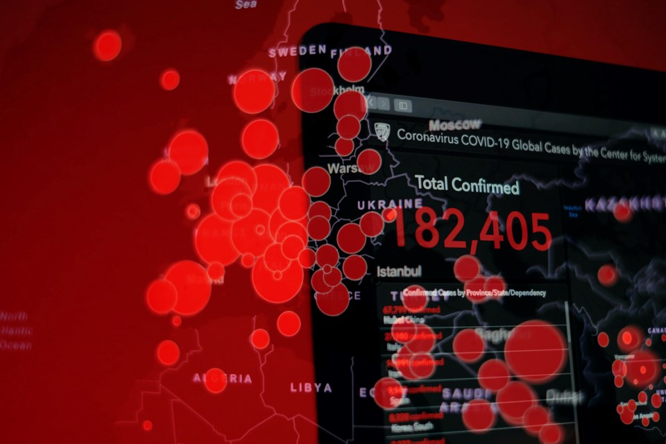
The animated bar chart race below shows selected global causes of death vs. COVID-19 from January 1 to May 23, 2020.
Using data from the Johns Hopkins COVID repository, Global Burden of Disease study and Worldometers populations, the graph was created by Tony Nickonchuk using Flourish, a data visualization and storytelling platform. The graph does not include deaths from cardiovascular diseases or cancer, which according to the World Economic Forum, are the top causes of death around the world.


